Cube approached LBD STUDIOS to discuss their upcoming development in the best address in Cotton Tree. During our discussions we identified they have continued to evolve their business model, and now primarily focused on creating owner occupier developments. Instead of just agreeing to complete the project brand work we suggested a brand refinement and evolution of Cube to ensure the brand reflected the quality of delivery and ambition they have in their DNA.
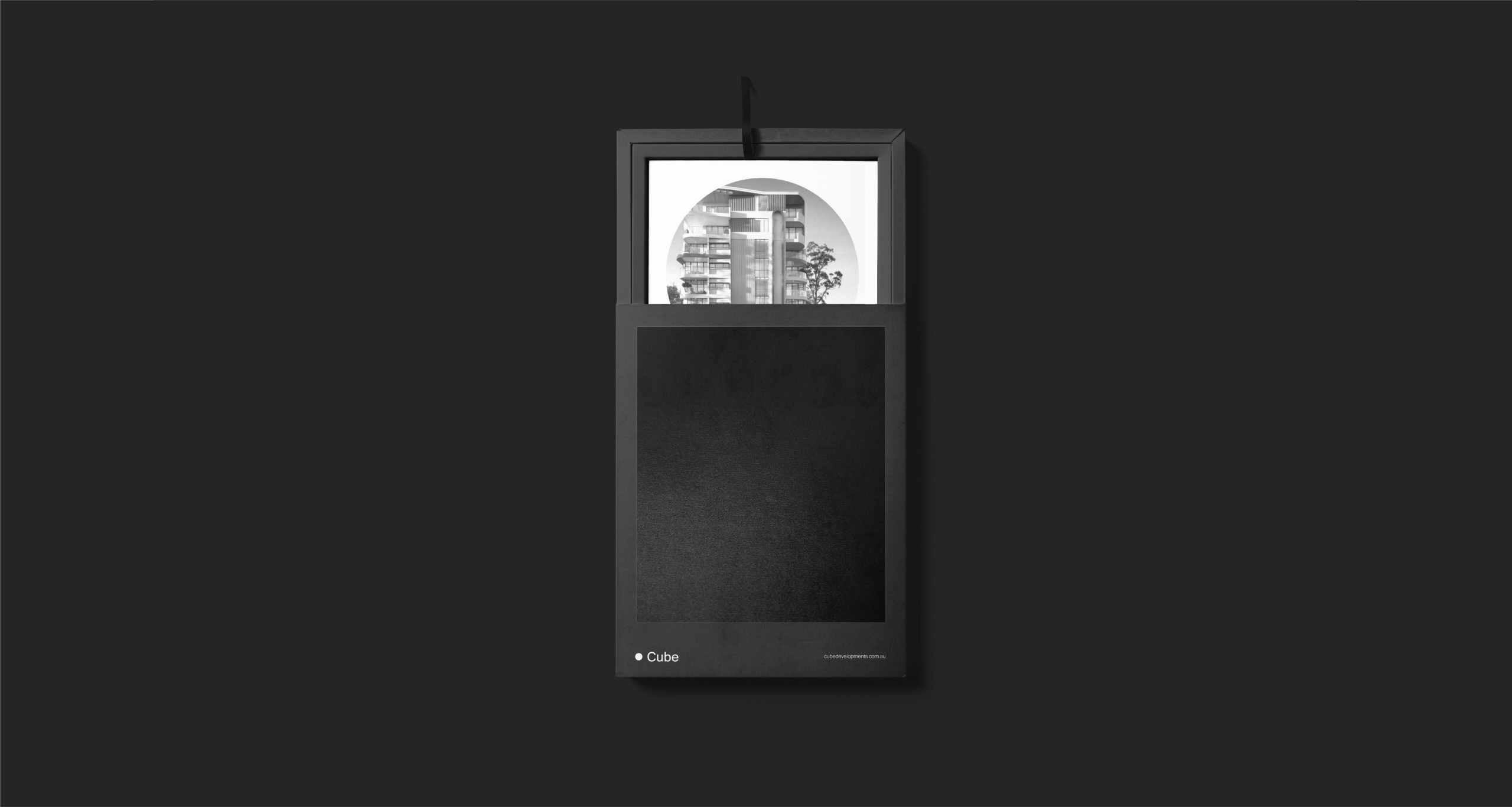
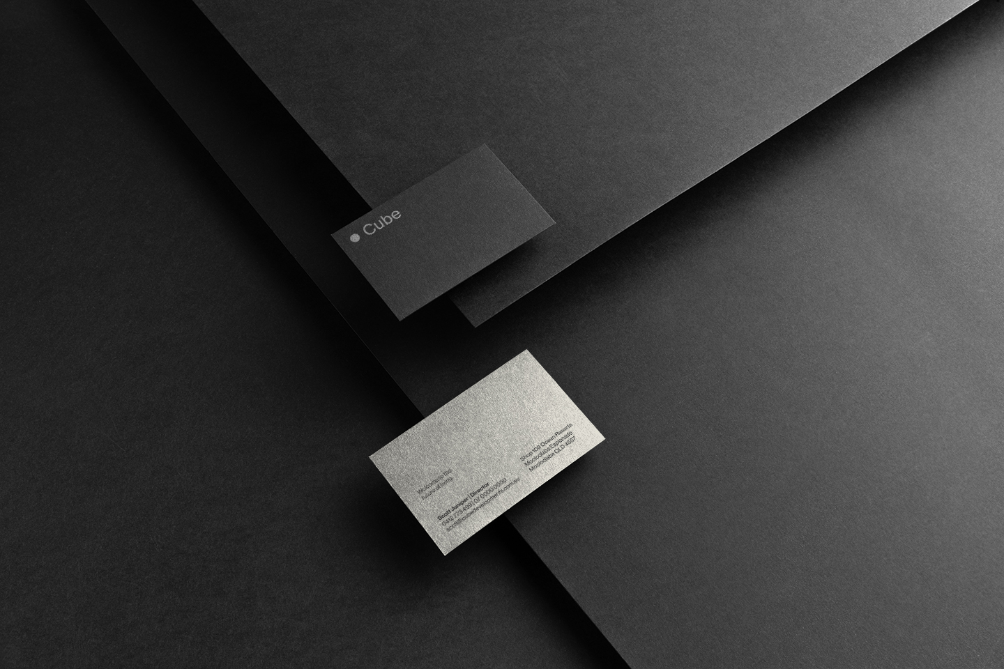
The evolution of the Cube brandmark is minimal, approachable and elegant. Steering away from the obvious square and rectangular shape, we incorporated circle instead. Why? Because that’s what they are all about. Expect the Unexpected. We developed a tone of voice that matched the bold visual identity, it had be be two things. Distinctive and consistent. Short and punchy sentences and with a dash of friendly attitude.