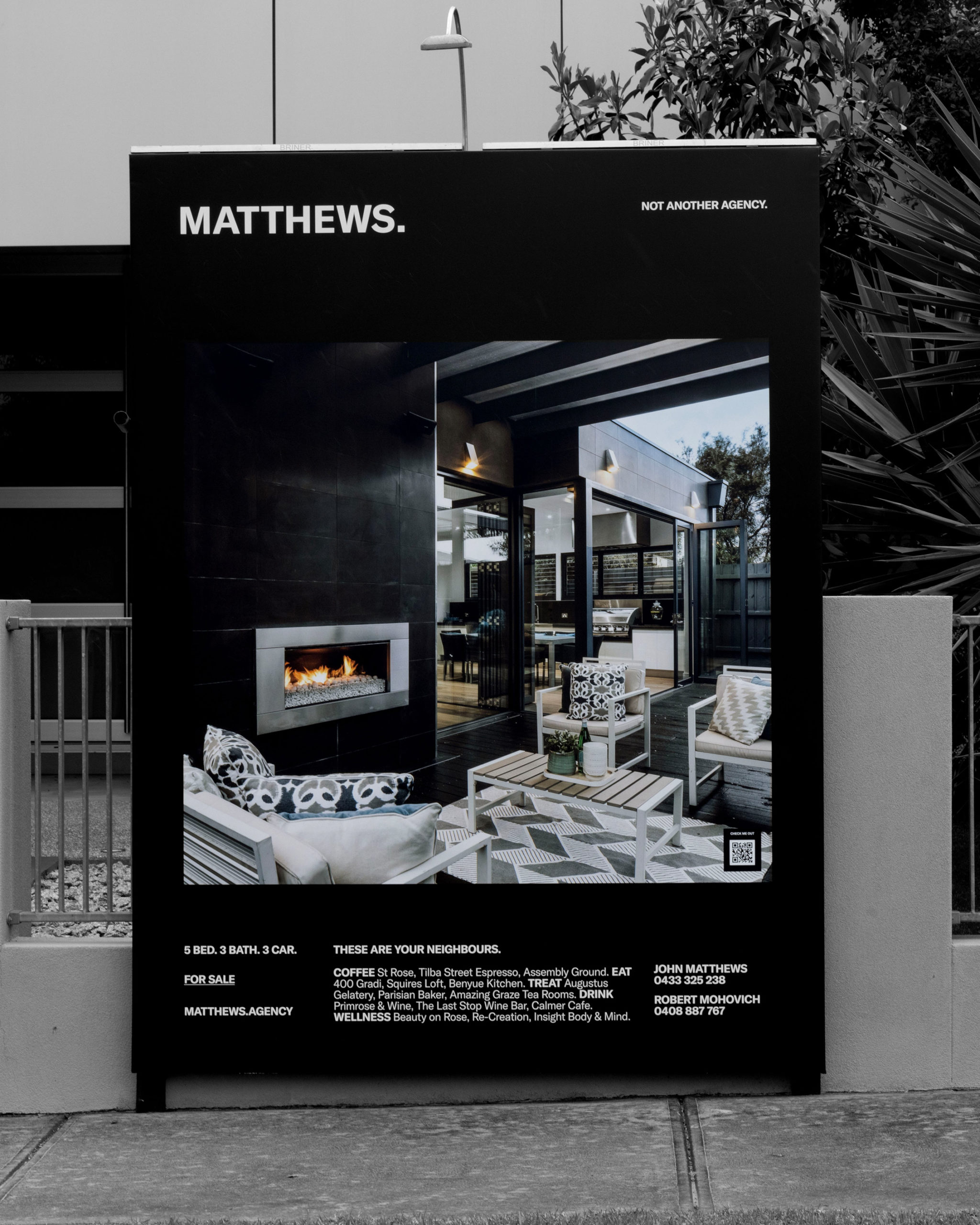
There’s a reason we put a full stop after Matthews. Well, a couple of reasons, really. First, it looks good on a billboard. Second, it represents their entire real estate philosophy. When they broker a lease or sell a family home, it’s a done deal — full stop, no contingencies or hidden sub-clauses, everything transparent, everything out in the open. The full stop is their statement of intent.
The use of all caps in the brandmark represents the strength and confidence of the Matthews brand. The characters are kerned relatively tight to create a stronger look and feel. Matthews, as a brand is all about the sense of community and to start a community, it starts with a conversation. Full stop may represents the end of a sentence, but never the end of a conversation. That’s why we crafted the brand visual language not only around the fullstop, but the whole punctuation marks.
