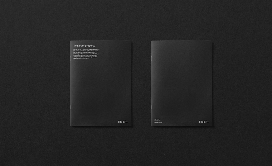
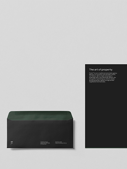
The brief was to create a brand for a high end property firm which was skilled, respected and would stand proudly on its own with a quiet confidence.There was a deliberate intention to create a collaborative business. We identified a gap where the business would not only have a deep understanding of property, negotiation and strategy but also celebrate the collaborators and architectural features of the assets he would represent. Bringing a new level of respect and understanding to the process and demonstrating what we term, the art of property.
Data-driven, analytical and symmetry is visualised in the FISHER TM identity in the form of uniform line and shapes. Creating an identity that is timeless & minimal, we crafted the FISHER brandmark in thin & refined typeface crafted and kerned out evenly, with the TM typeset in the midline of the brand creating a distinguished look.