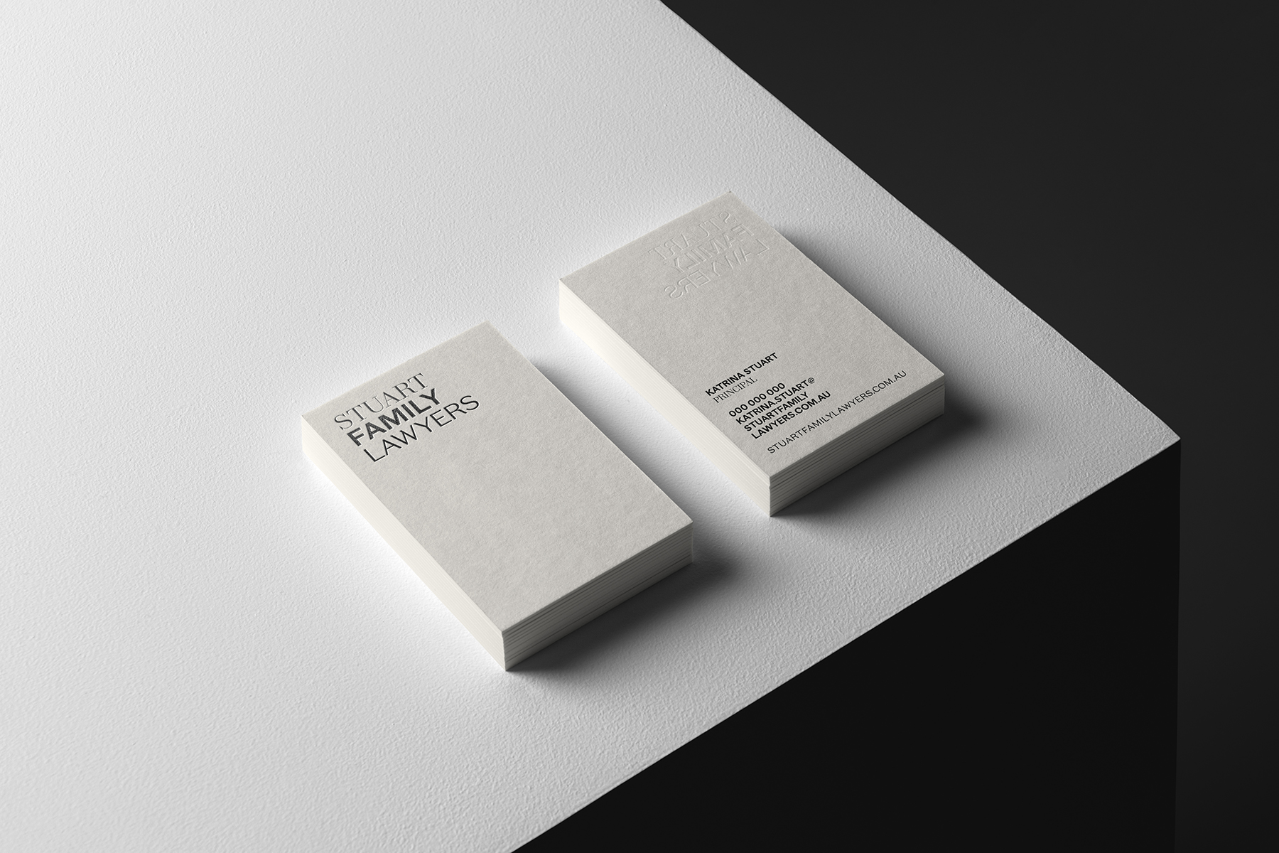
Stuart Family Lawyers is a boutique family and relationship law firm. They provide their clients with a high level of service, with a focus on strategic and practical legal advice. The brandmark is inspired by Stuart Family Lawyer’s approach to their work. The affirmation that each case is different and therefore should be considered with the same care and open-mind as if dealt with for the first time, is at the core of this concept. Typography is at the core of design thinking. Letters are designed to express an idea, a mood, values and they can even convey a certain culture. The typefaces for the Stuart Family Lawyers visual identity have been carefully considered to convey both the overarching idea, but also a set of nuances.
The typography of ‘Stuart’ leads the way in – it functions as a leader without overshadowing the group. The visual emphasis on ‘Family’, not only balances the whole, but it also reinstates what matters to the viewer and client: that ‘Stuart Family Lawyers’ is focussed on offering excellent attention to the client’s specific circumstances. ’Lawyers’ is the method and the profession, through which the two are connected and the case gets resolved.